Logo
In 1969 Michael Jeans-Jakobsson, then Station Director, came up with the initials YSTV for the newly formed student television station, and they have remained in use ever since. The realisation of those letters into a visual logo has varied considerably over the years since then. Unfortunately the original logo has not survivedUnverified or incomplete information, but is described as similar to the current (2000) logo.
2000 Logo
The current YSTV logo was designed by Matt Hammond and launched in the summer of 2000. This has remained in use ever since, although frequently extended, for example in the Idiot Logo. The final production was done in Adobe Illustrator on The Mac. As a result it was exported to every conceivable format for the multiple computers then in use in the station. There are also 3D line art versions, although they have never been widely used on-air.
Designing the logo in pure black and white had the immense advantages that it can be inverted for either light or dark backgrounds, and is easily reproduced on almost any media, including TV screens and photocopied paperwork.
Variations
- The "Idiot" Logo
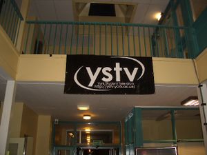
- Created by Dave Baker in the Autumn of 2003 for that year's Freshers' Week posters. It was simply the full name of York Student Television and the website address crammed into the main YSTV logo for the benefit of anyone who didn't know what it stood for - hence the name. Although knocked up very quickly it made it onto many t-shirts, merchandise and even the giant YSTV banner used at events.
- The Glowgo
- A white version of the YSTV logo with a coloured glow emerging from behind each letter - arguably the most known logo as it has been part of the website's masthead since 2009.
- Pudsey Logo
- Created (bodged) together by Michael Chislett just before Children In Need 2009, by laying images of Pudsey Bear on top of the normal logo then removing it, leaving a logo of Pudseys. This featured briefly during CiN when VT playout PC was having difficulty playing out widescreen and HD videos.
- Logo variants
The website's "Glowgo" (2013 high-res recreation, vector version available)
Past logos
Not much is known about other early YSTV logos, however Election 84 does feature a rather intimidating logo featuring a quite Orwellian Eye of Ra. A chunkier logo with vertical lettering appears in photos from the mid-80s, and on some paperwork from the period. In 1986 the launch of colour broadcasting saw the introduction of a new colour logo, but it didn't last very long, and by Election Night Live 87 the cube logo was in use. The text and rendering of the logo changed over time - a stylised version was in use in the mid 90s, while a capitalised version was in use by the time it was scrapped.
Cube Logo
There have been lots of variants of the YSTV cube logo used at different points, although all have the key elements of a 3-D cube with red, green and blue faces. They are normally accompanied by the initials YSTV in a variety of fonts and colours, including the "YSTV Worm" which was used in the 1990sUnverified or incomplete information.
An on-air version of the cube, a simple computer animation in which the three pieces of the cube revolve into view with the simple caption "York Student Television" underneath, was used from 1988 (when it was written by Jon Beardmore under the alias 'Jon Le Hacker' for Breaker 88) right through to the logo being dropped in 2000. It can be seen at the start of the YSTV Gold ident.
The last frame of this was also used as a program start/end slide on many productions. Another animated version has the three sides of the cube come tumbling past the camera in 3-D to make up the familiar cube, before the camera pans back to reveal the letters YSTV below it. This is used on the start of Breakthru and the 1995 Review of the Year.
- Past logos
For the 40th Birthday Party
