Logo: Difference between revisions
mNo edit summary |
Dummy User (talk | contribs) (make links for logo-specific pages) |
||
| Line 1: | Line 1: | ||
The current YSTV logo was designed by [[Matt Hammond]] and was launched in the summer of 2000. | The [[2000 Logo|current YSTV logo]] was designed by [[Matt Hammond]] and was launched in the summer of 2000. | ||
It replaced the previous "cube logo" which dated back to the mid 1980s ({{unsure|possibly}} co-inciding with the launch of colour broadcasts), which was scrapped because it was thought to look dated. The text that accompanied this logo changed over time - a stylised version was in use in the mid 90s, while a capitalised version was in use by the time it was scrapped (known as "the worm"). | It replaced the previous "[[cube logo]]" which dated back to the mid 1980s ({{unsure|possibly}} co-inciding with the launch of colour broadcasts), which was scrapped because it was thought to look dated. The text that accompanied this logo changed over time - a stylised version was in use in the mid 90s, while a capitalised version was in use by the time it was scrapped (known as "the worm"). | ||
Not much is known about other YSTV logos, however [[Election 84]] does feature a rather intimidating logo featuring a rather Orwellian-looking eye. | Not much is known about other YSTV logos, however [[Election 84]] does feature a rather intimidating logo featuring a rather Orwellian-looking eye. | ||
Revision as of 18:56, 8 May 2007
The current YSTV logo was designed by Matt Hammond and was launched in the summer of 2000.
It replaced the previous "cube logo" which dated back to the mid 1980s (possiblyUnverified or incomplete information co-inciding with the launch of colour broadcasts), which was scrapped because it was thought to look dated. The text that accompanied this logo changed over time - a stylised version was in use in the mid 90s, while a capitalised version was in use by the time it was scrapped (known as "the worm").
Not much is known about other YSTV logos, however Election 84 does feature a rather intimidating logo featuring a rather Orwellian-looking eye.
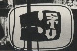
This logo also appears in photos from the mid-80's. (It's got some stuff in the way, the actual logo doesn't have the vertical black lines.
See also Idiot Logo.

